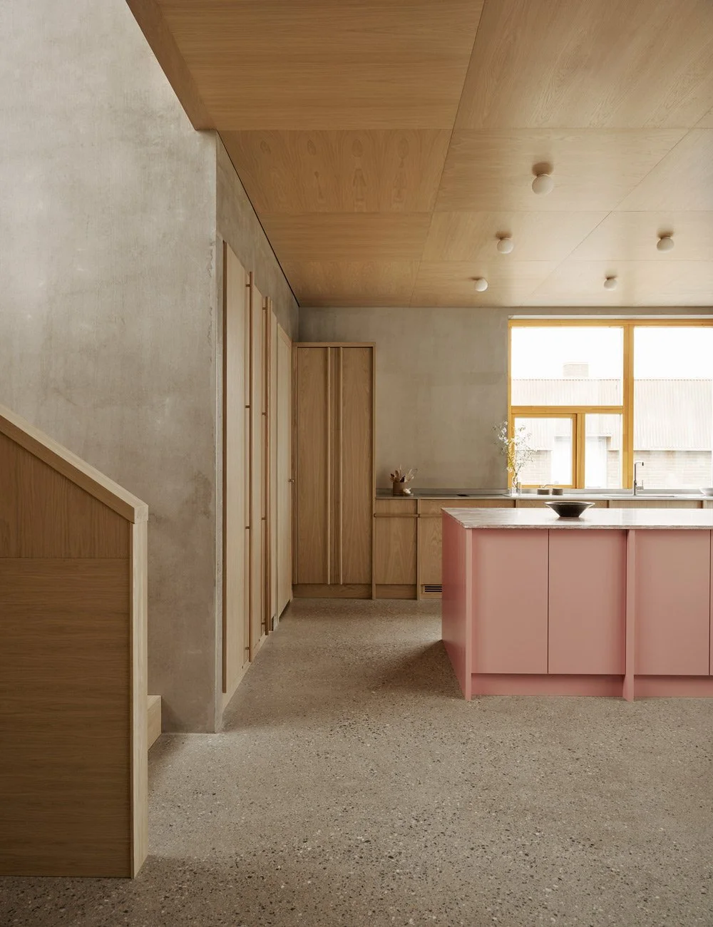
The Contemporary Wood Kitchen in the Colorful Apartment
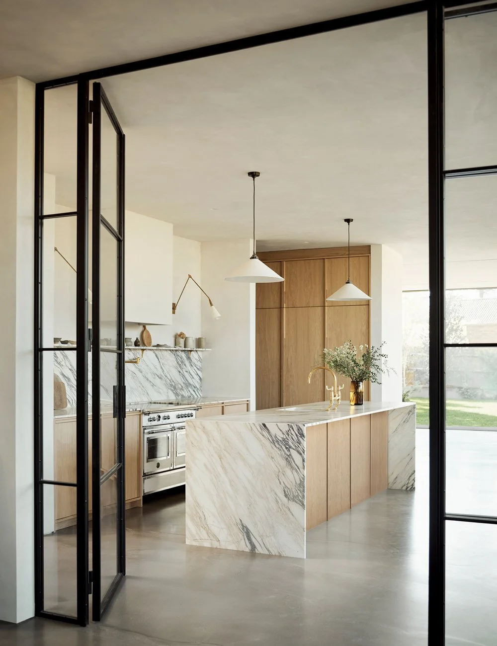
Through thoughtful color choices and soft contrasts, interior designer and color expert Ida Lauga has created a home for Irini and Martin that feels both warm, harmonious and full of character. At its heart, the wood kitchen from Nordiska Kök — crafted in warm oak and expressive marble — forms a calm, considered space, quietly echoing the colors and warmth that flow throughout the apartment.
See more wood kitchens from Nordiska Kök
The contemporary wood kitchen designed by Nordiska Kök features smooth cabinet fronts in dark oak paired with an expressive marble worktop, giving the space a warm, calm atmosphere and tactile feel. Bar stool by Massproductions. Wall lamps “Teti” designed by Vico Magistretti for Artemide.
Throughout the home, the color palette has been carefully considered to create a sense of balance and harmony. Leather armchair by Ethnicraft. Wooden bench, vintage. Side table designed by Charles & Ray Eames for Vitra.
In the beautiful 164-square-metre apartment, Irini and Martin live with their two children. This is the couple’s second renovation together — a project where color and carefully selected materials have been the guiding theme throughout.
– This time, we wanted to do what we didn’t dare to do last time: be brave with color. To work with bolder tones, create more playful children’s rooms, and place greater emphasis on the ceilings, Irini explains.
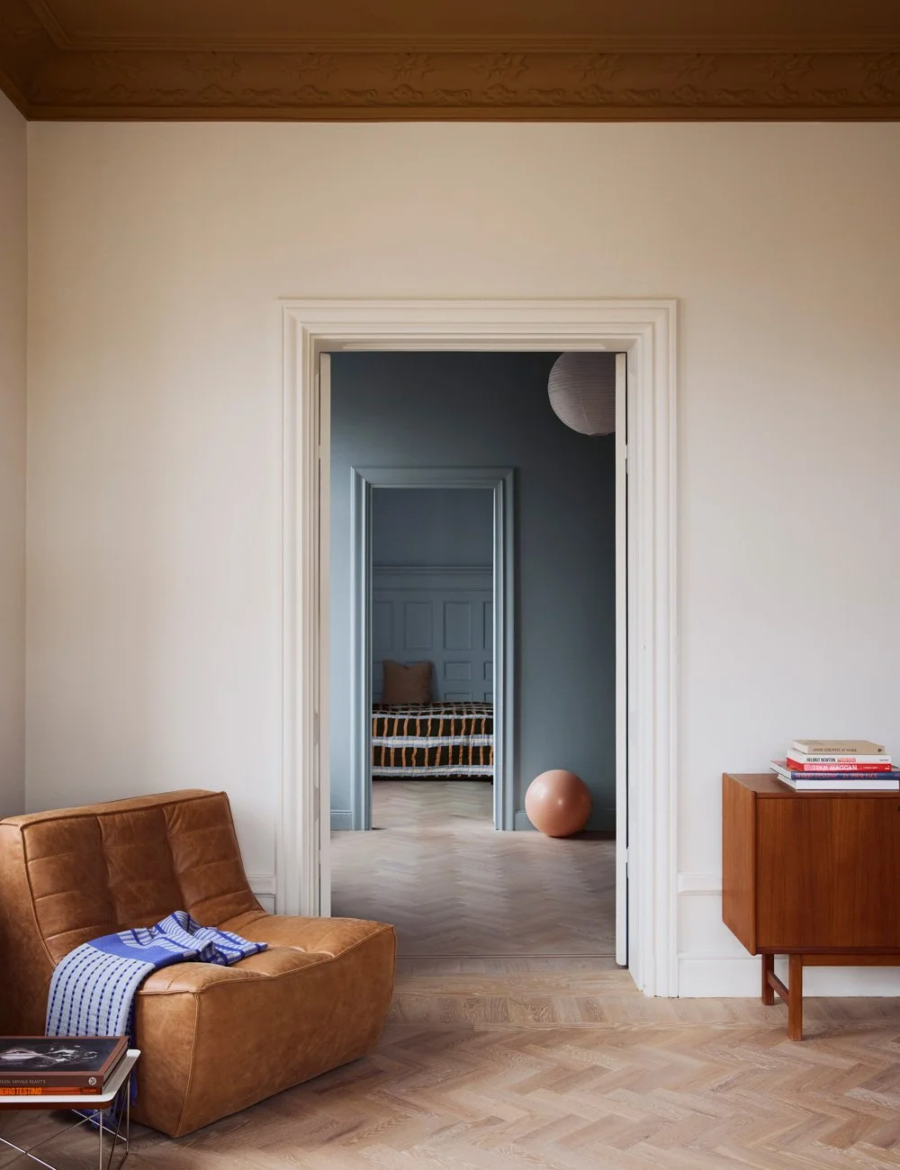
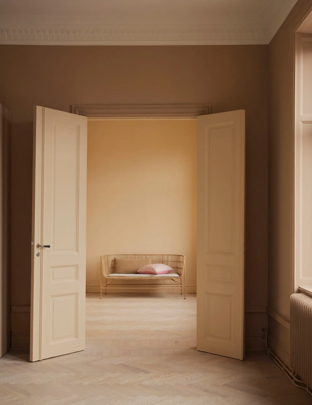
For the generous apartment, with its long sightlines between rooms, Irini and Martin enlisted interior designer Ida Lauga to help shape the overall color palette, resulting in a balanced mix of warm and cool tones of blue, peach, mustard and beige.
Known for creating expressive interiors through the use of color, Ida explains how she approaches balance and harmony when working with color.
– For me, harmony in a home is essential. Here, we’ve worked with bold colors — both warm and cool — and balanced them against each other. This home is a great example of how you can be brave with color without the result feeling scattered, she says.
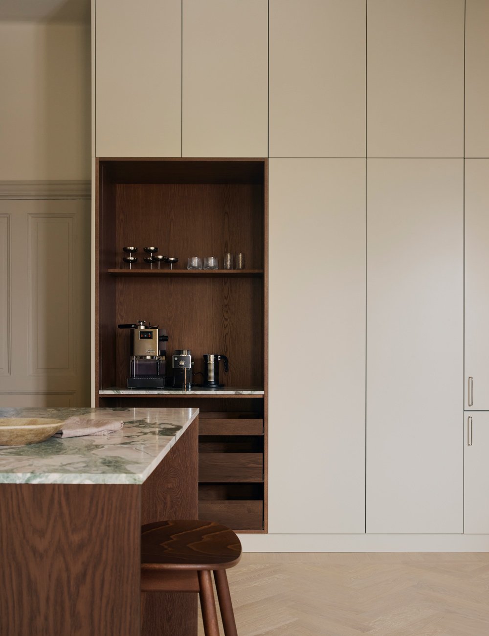
One feature Irini and Martin are particularly pleased with in the kitchen is the tall cabinet wall that runs all the way up to the 3.3-metre-high ceiling. It offers generous storage, integrated fridge, freezer and wine cooler, as well as an open pocket cabinet that functions as a coffee station.
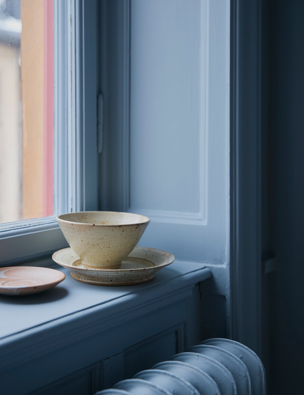
By painting walls, ceilings, radiators and mouldings in the same shade, a softer and more refined impression is created in the home.
For the kitchen, the couple envisioned a spacious and social setting with generous storage, where materials and colors would be more restrained than in the rest of the apartment — without losing the warm, lively atmosphere that runs throughout the home.
The kitchen’s design is minimalist, yet softened by carefully chosen natural materials. Base cabinets in dark oak are paired with painted tall units, while an expressive marble worktop introduces tones of white, blue, pink and green.
– As the rest of the apartment is very colorful, we chose a more muted palette for the kitchen and balanced it with a vibrant worktop. We’re very pleased with the tall cabinets, which provide ample concealed storage alongside an open coffee cabinet — and with the decision to use two different colors for the cabinet doors, Martin explains.
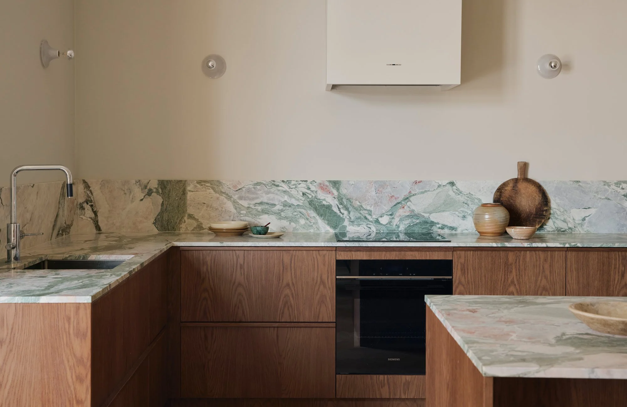
The smooth dark oak cabinet doors, with their rich natural grain, are paired with expressive marble to give the kitchen a warm and calm presence, while still retaining a sense of life and character. Instead of traditional knobs, solid oak grip handles were chosen — a perfect match for the kitchen’s minimalist design, while also enhancing the sense of craftsmanship and quality. Kitchen tap by Tapwell.
With the freedom to choose any color for a Nordiska Kök kitchen, the bespoke tall cabinets were painted in the same warm beige tone as the walls and extractor hood. A shade that works beautifully with the rest of the home’s palette, and contributes to the kitchen’s soft, warm expression while allowing the natural materials to take centre stage.
– The dark wood in the kitchen is both dominant and beautiful. Rather than choosing a white wall color, which would have created a harsher look, we opted for a soft, warm tone to enhance the overall warmth of the space, Ida explains.
Thinking about how rooms relate to one another, and choosing colours and combinations accordingly, is one of Ida’s top tips for creating a home where each room has its own identity, while still feeling visually connected.
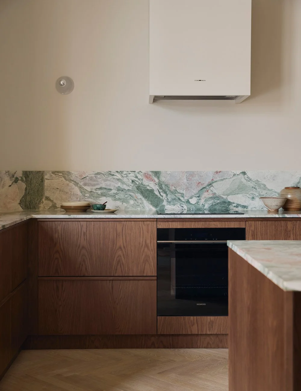
The kitchen balances warm and cool tones just like in the rest of the home. There is harmony and balance between materials and colors, where dark oak and warm light beige meet the cooler hues of the worktop and silvery details. Oven from Siemens, kitchen hood from Fjäråskupan.
Throughout many of the rooms, walls, ceilings, mouldings and stucco have been painted in the same color — a technique known as color drenching — creating a cohesive, enveloping and calm atmosphere, even when working with bolder shades. By allowing the surfaces to blend seamlessly into one another, transitions become softer and the overall expression feels more considered and at ease.
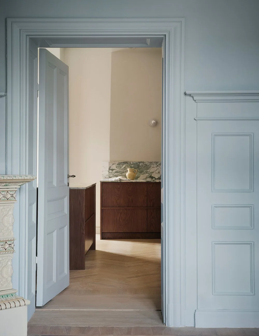
From one of the blue rooms, you can see how the blue shade is echoed in the vibrant marble worktop in the kitchen — an elegant and thoughtful way of working with color and sightlines to visually connect the different spaces.
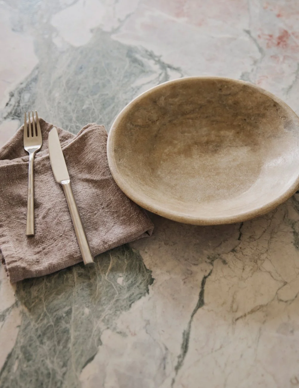
The “Four Seasons” marble worktop was chosen for its vibrant and beautiful veining, where tones of green, pink, blue and soft white emerge in elegant contrast to the kitchen’s muted palette.
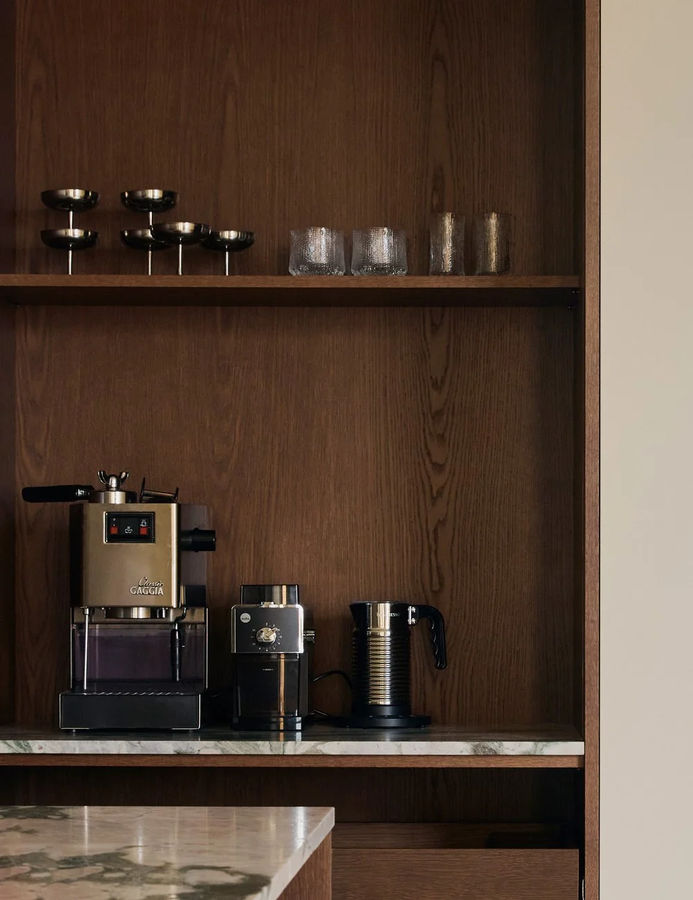
The warmth and grain of the dark oak are beautifully highlighted in the open pocket cabinet that houses the family’s coffee station. Metal coupe glasses from Hay.
Ida concludes by sharing her best advice on how to work with color to create a home that feels cohesive and harmonious, while still allowing each room to retain its own identity:
– Think about how the rooms connect and how the spaces flow into one another. If you paint the doors, consider how they appear when open, set against the color of the adjoining room. Always keep the bigger picture in mind. A helpful tip is to view all the colors together — does one stand out too much, or does something feel slightly off? Experiment with different combinations. And if you want to develop a more considered color scheme, professional guidance is always an option.
– When it comes to color, I don’t really believe in strict rules. A dark ceiling can work beautifully with light walls, just as a deeper shade can be perfect in a child’s room. What matters most is trusting your instinct and choosing combinations that feel inspiring and bring you joy, she adds.
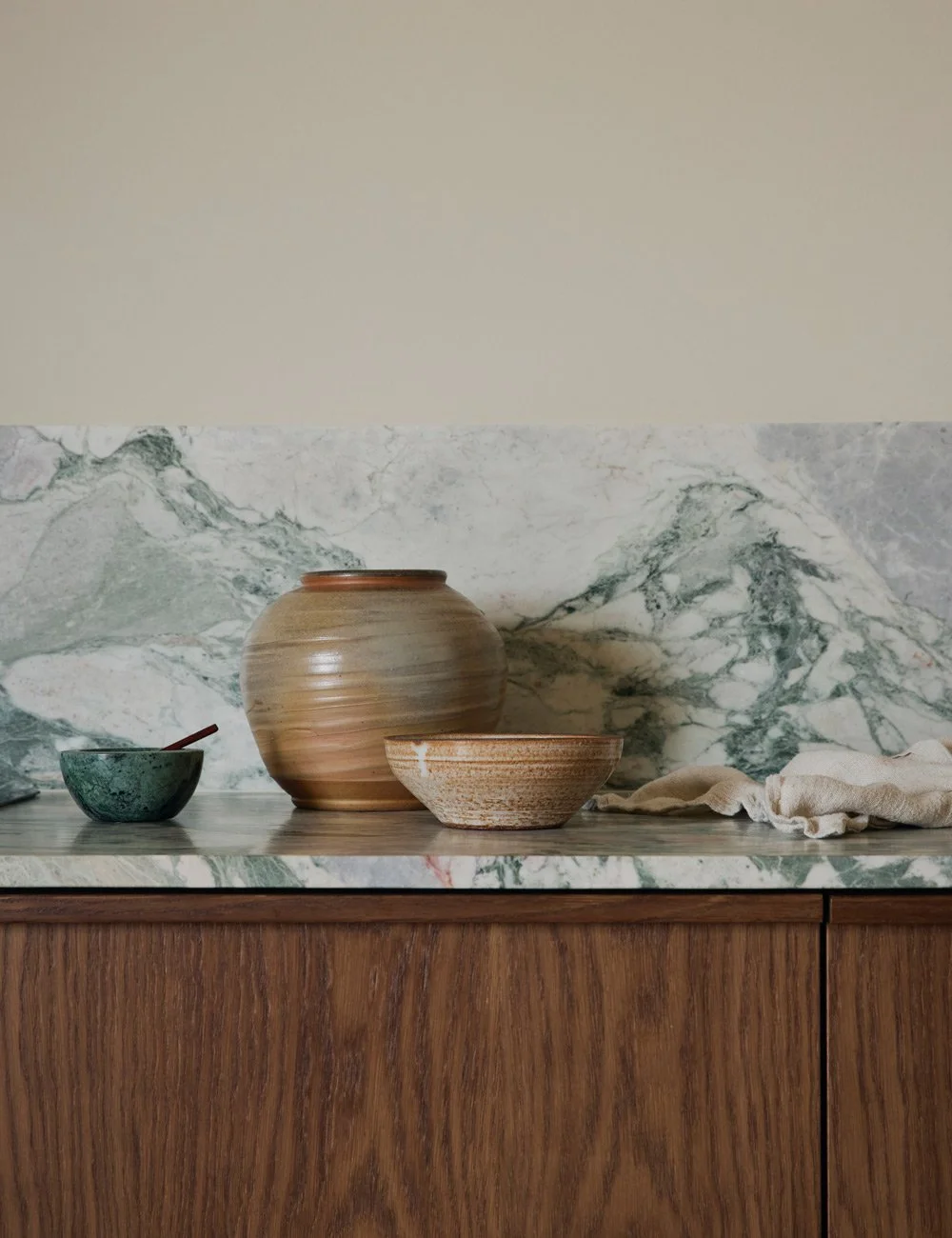
The kitchen’s muted palette strikes a perfect balance between warm and cool, just like the rest of the home. Big ceramic vase from Bonnibonne.
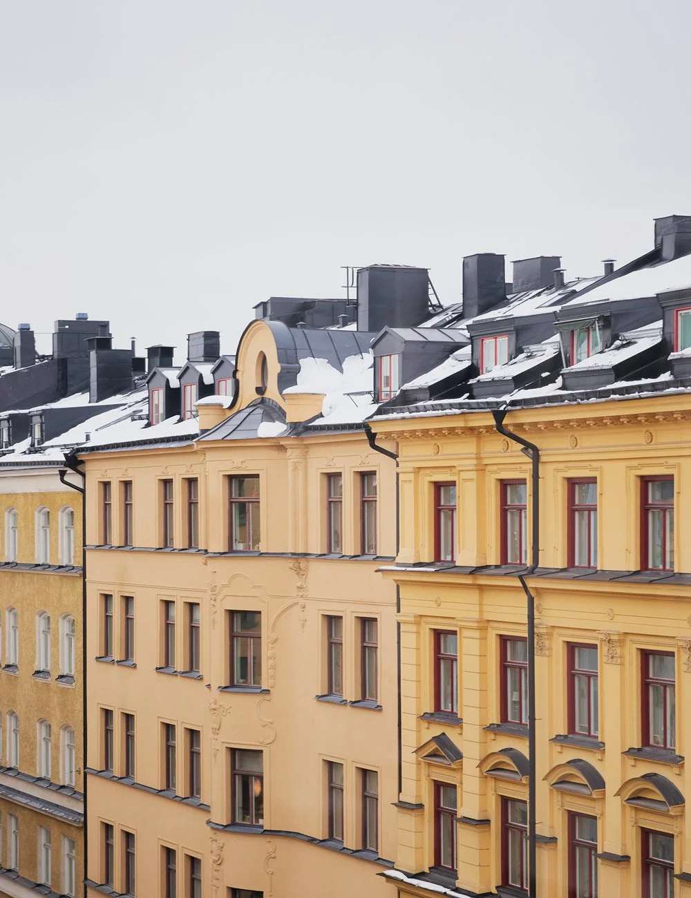
The beautiful apartment from 1904 is located in the charming Vasastan district of Stockholm.
Get inspired by more colorful kitchens by Nordiska Kök
Photo: Fanny Rådvik for Nordiska Kök
Styling: Ida Lauga