The Pink Kitchen in the Architect-Designed Villa
In the architect-designed concrete villa, geometric forms, bold colours and unexpected material combinations come together in a carefully balanced and considered composition. The expression is both playful and refined, where tactile materials, soft contrasts and architectural details interact to create a warm, cohesive atmosphere.
See all wood kitchens | About our wood kitchens | Wood kitchen prices
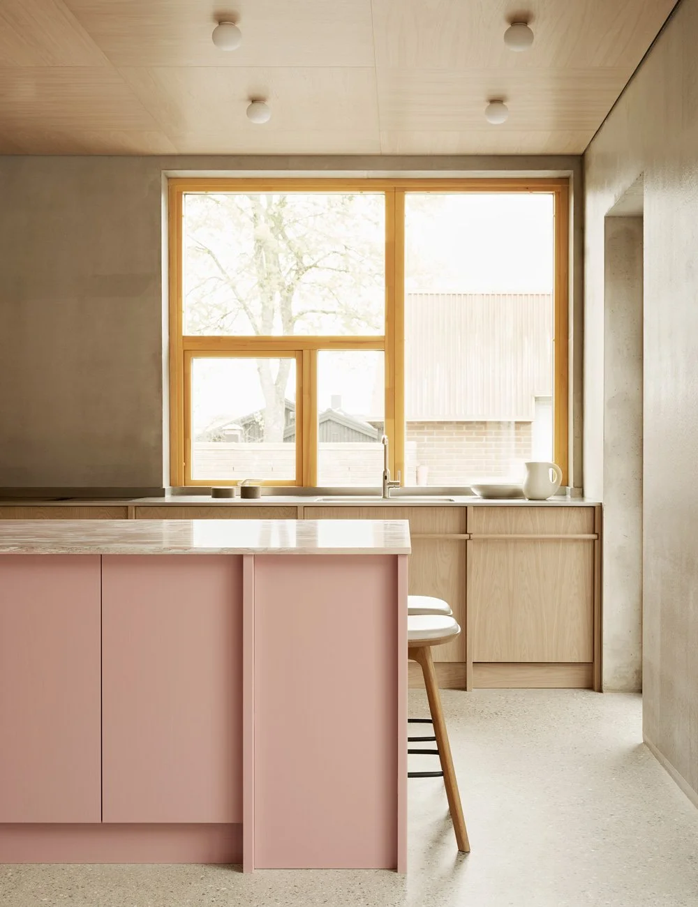
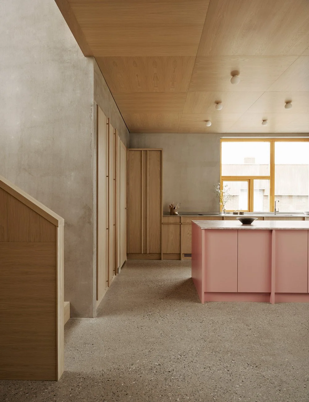
The pink kitchen is a bespoke design by Nordiska Kök, created in close collaboration with architect Elin Lorenzi for an architect-designed concrete villa in Sweden.
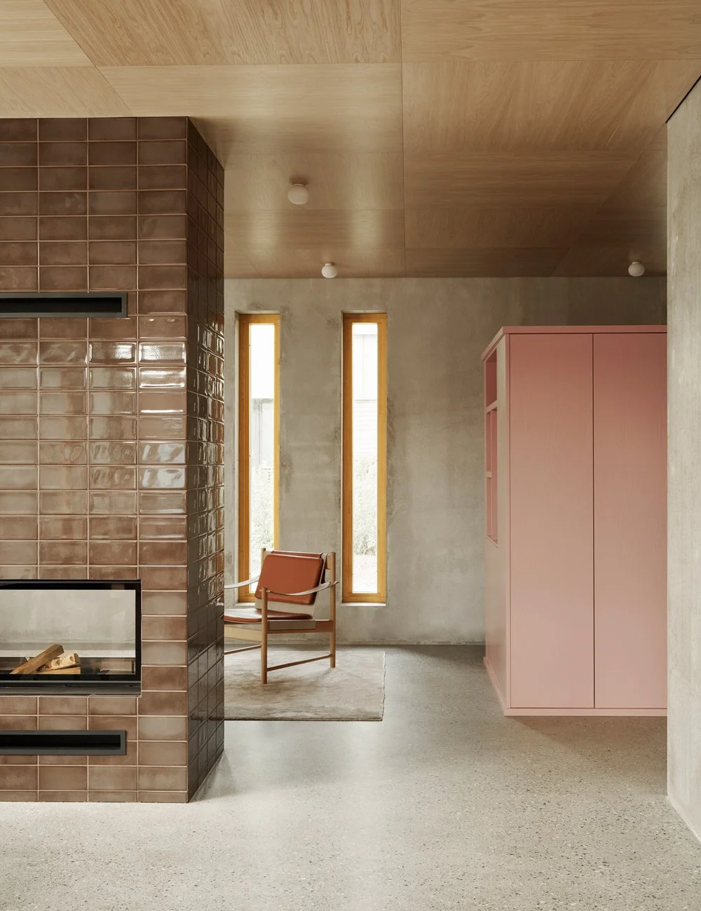
The pink hallway unit and the light oak ceiling are also bespoke elements by Nordiska Kök, created specifically for the house. The armchair is the HB Lounge Chair by Brdr. Krüger.
Behind the project is architect Elin Lorenzi, who, in close collaboration with Nordiska Kök, has shaped a home where every detail is thoughtfully considered. At the heart of the home is the kitchen from Nordiska Kök – where pink tones and light oak meet raw concrete and stainless steel details.
The house is constructed from prefabricated concrete, with the ambition of creating a calm and cohesive expression where the materiality itself is allowed to take centre stage.
Concrete recurs throughout both the interior and exterior – across walls, floors and façades – forming a clear architectural foundation throughout the house. Against the raw concrete surfaces, carefully selected materials and bold accent colours create contrast, warmth and depth.
– Working with the same material both inside and out creates a more cohesive feeling and allows fewer materials to compete for attention. That has made it possible to work more freely with bold and vivid accent colours, while still maintaining a balanced overall expression, says Elin.
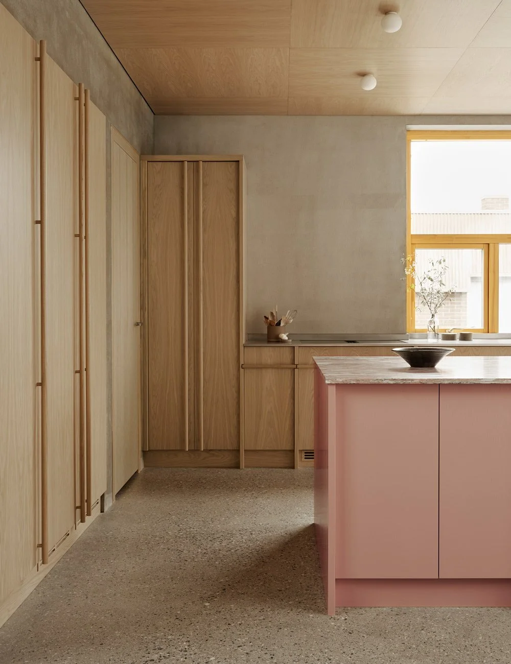
The kitchen by Nordiska Kök features a long run of base cabinets and built-in tall cabinetry with integrated storage for the fridge, freezer and pantry. At its centre, a pink kitchen island serves as both a practical workspace and a natural gathering point for cooking and socialising.
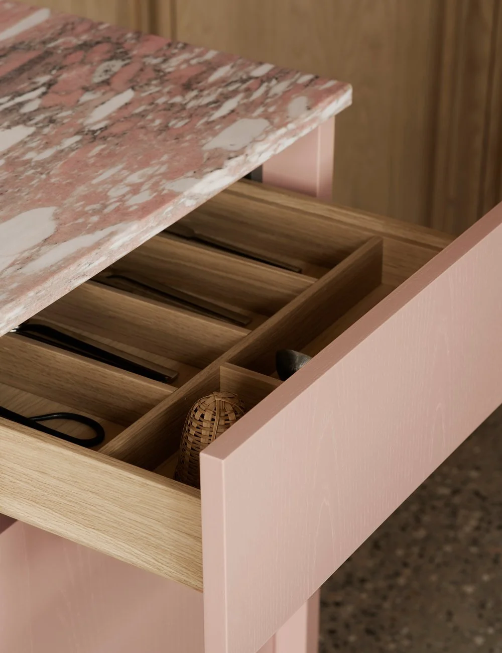
Solid oak drawers with custom-made cutlery inserts and painted fronts, allowing the oak’s natural grain to remain beautifully visible.
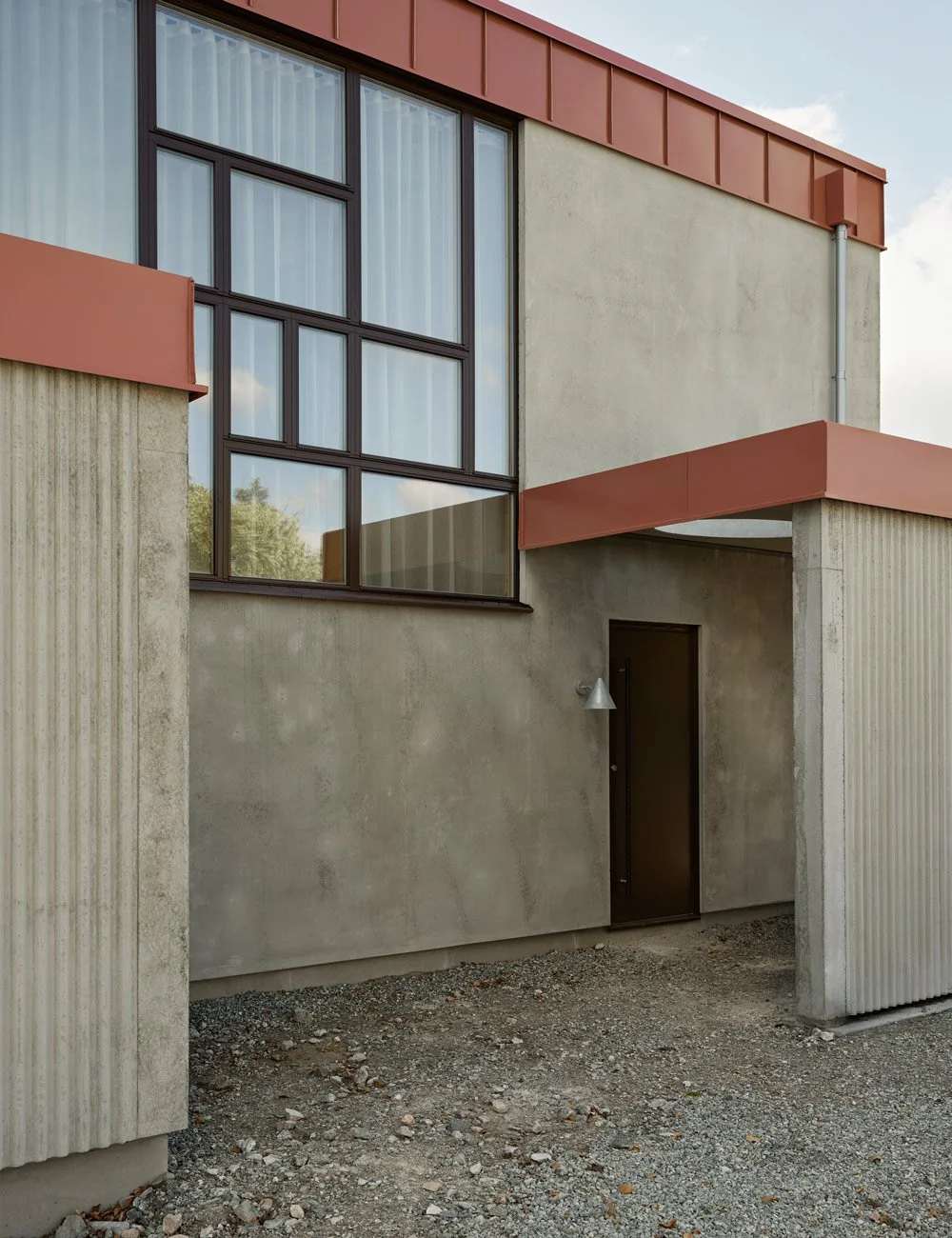
As a subtle reference to the kitchen, pink tones also reappear in the exterior, where the metal coping has been finished in a darker, more muted shade of pink to create a clear connection between inside and out.
The kitchen as the heart of the home
The kitchen is the natural heart of the home — both functionally and aesthetically. It brings together several of the house’s defining materials and colours in a balanced composition, where soft pink tones, Fauske marble, light oak, stainless steel and raw concrete meet.
The pink kitchen island serves as the kitchen’s focal point, while the pink hue is echoed throughout the hallway, bathroom and children’s bedroom, creating a cohesive flow throughout the interior. The worktop in Norwegian Fauske marble adds depth and character, while tall cabinets in light oak bring warmth and a sense of calm.
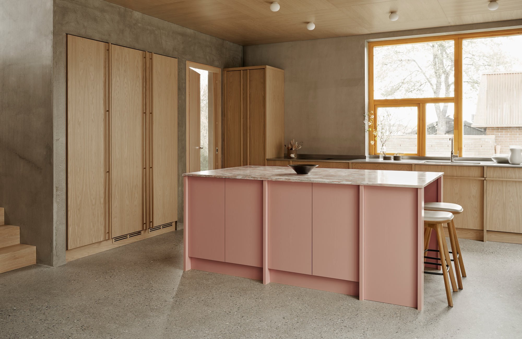
The ceiling in the kitchen is clad in light oak from Nordiska Kök, adding warmth and creating a cohesive connection with the bespoke tall cabinets in the same material. The ceiling fixtures are the Flos Mini Glo-Ball. The stainless steel worktop is from Purus, and the bar stools are the Pauline Bar Stool by Brdr. Krüger.
A bold yet carefully balanced colour palette
The colour palette is bold, yet carefully balanced. Alongside the pink tones, Elin has also chosen to work with several vivid accent colours throughout the home. The upstairs bathroom contrasts with glossy bright blue tiles and a striped floor with a graphic expression, while the smaller bathroom and a tiled fireplace in the hall introduce warmer brown tones to the home’s material palette.
– Brita and Alexander, who live in the house, had already embraced bold colours in their previous home and are confident and adventurous in their aesthetic choices, particularly when it comes to colour. That gave me the confidence to propose more expressive colour combinations. Since the colours are rarely experienced all at once, each room is allowed its own identity and atmosphere, resulting in a home that feels both cohesive and unexpected, Elin explains.
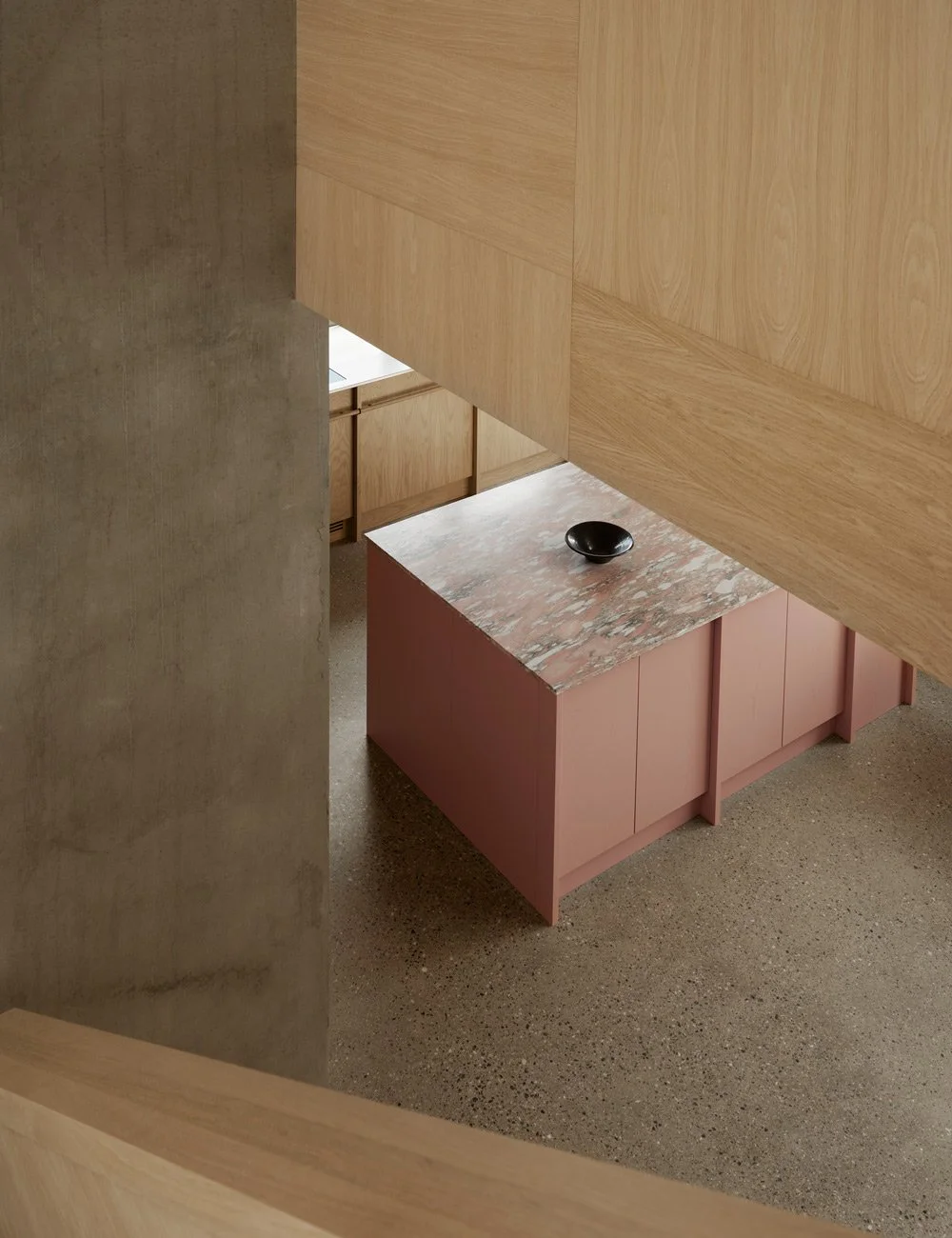
Viewed from the staircase leading down to the ground floor, the pink kitchen island is the first feature to catch the eye.
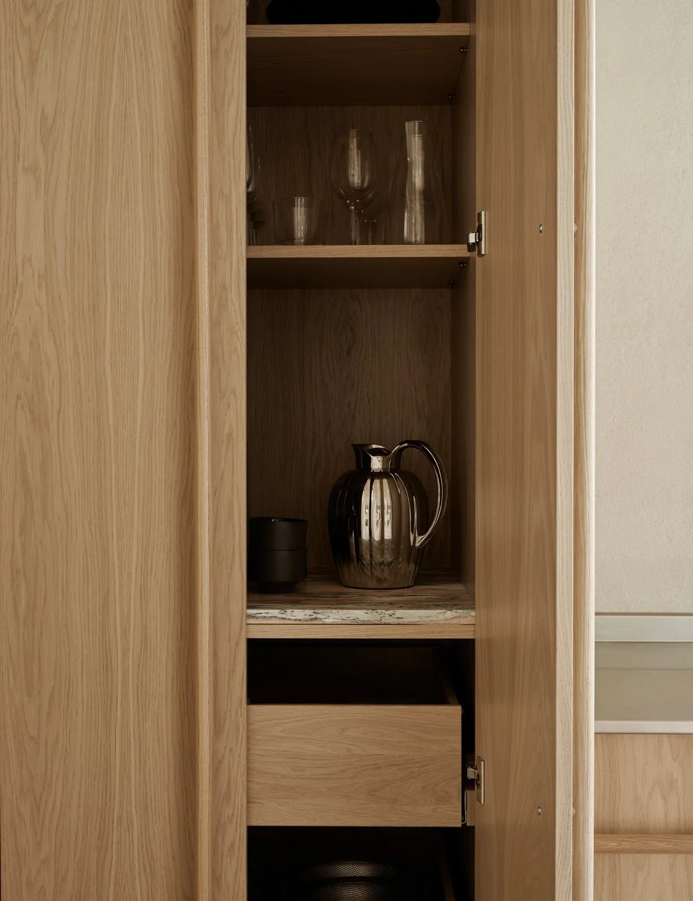
Inside one of the pantry cabinets, the Fauske marble worktop reappears – an elegant way of tying the kitchen’s expression together. Jug by Georg Jensen.
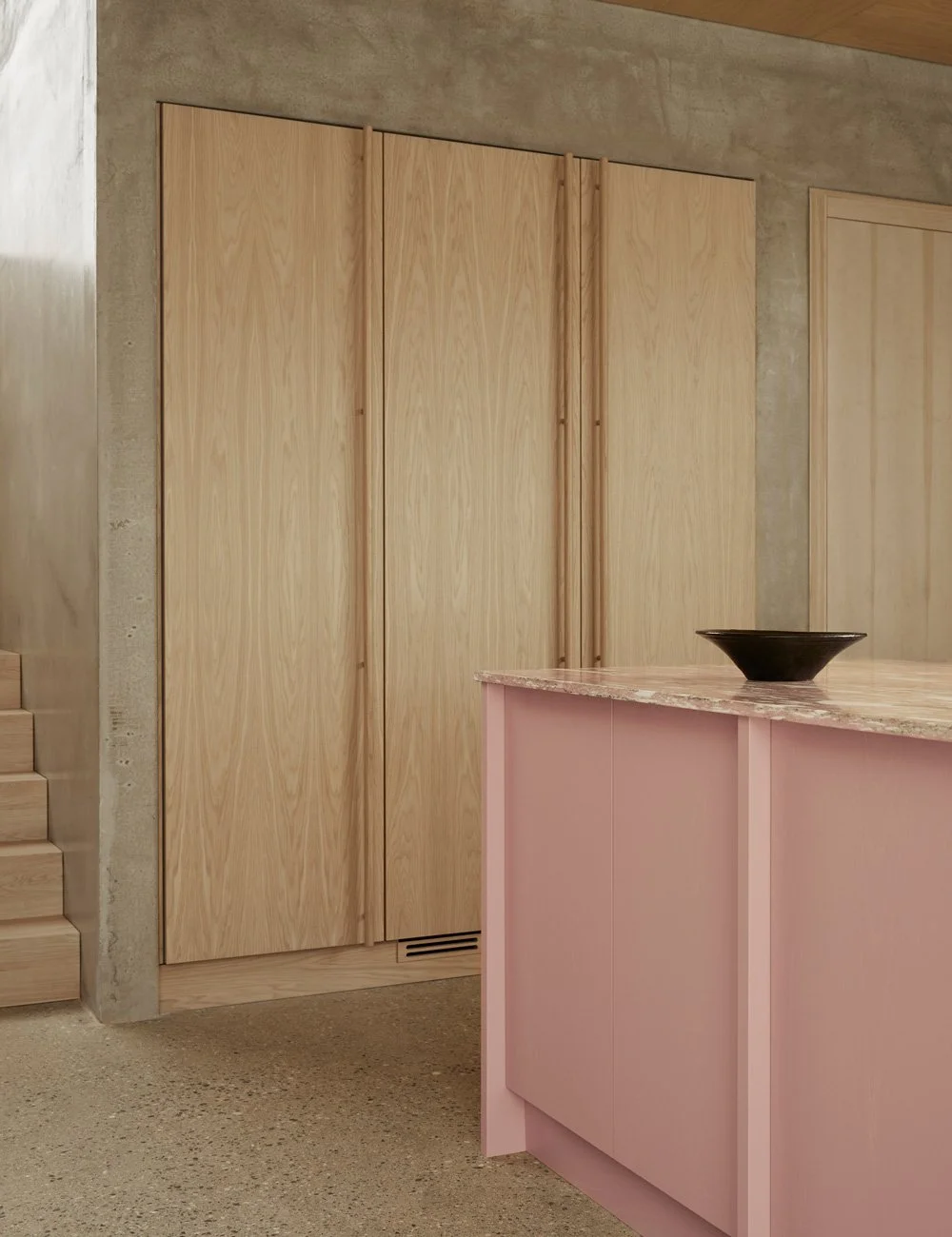
The details throughout the kitchen, much like the house itself, have been designed with great care — rounded handles in solid oak, made to the same length as the cabinet fronts, introduce a soft and almost furniture-like quality to the design.
For Brita and Alexander, it was important that their new home retained the same personal and expressive feel as their previous one. When building from scratch, they worried they might automatically lean towards safer, more restrained choices, but together with Elin and Nordiska Kök they instead embraced bolder ideas, working with rich colours and unexpected combinations of materials.
– We enjoy homes with personality, colour and character, because those things make a home feel welcoming and joyful to us, says Brita.
One of Brita’s best tips for creating a more personal home with greater use of colour is to choose two or three shades you genuinely love and let them reappear throughout different rooms and materials. She also encourages people to be braver with colour in bathrooms and not to shy away from mixing different materials and wood finishes together.
Learn more: Kitchen Guide – Choosing the right colour
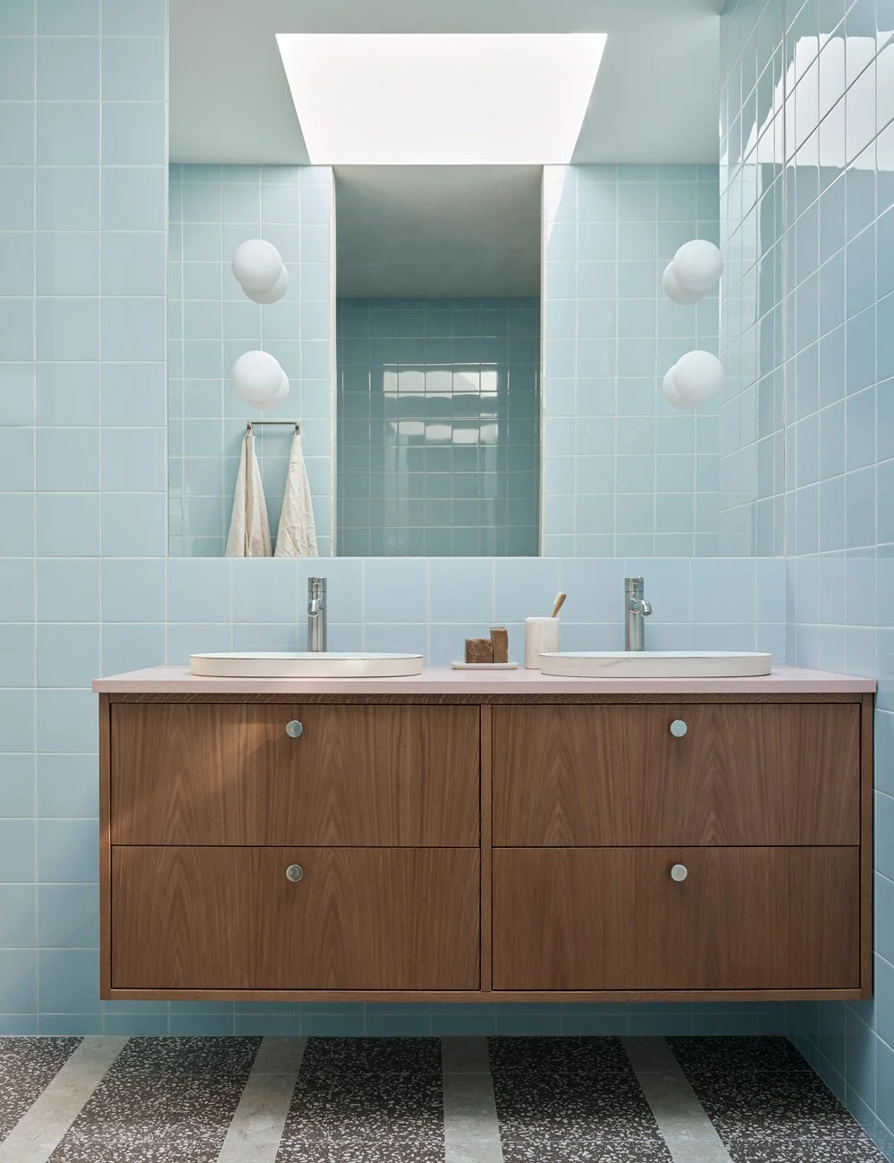
The vanity unit in warm oak is also from Nordiska Kök, with the soft pink tones echoed in the worktop to create a cohesive connection between the different spaces. Discover Nordiska Kök Bathroom.
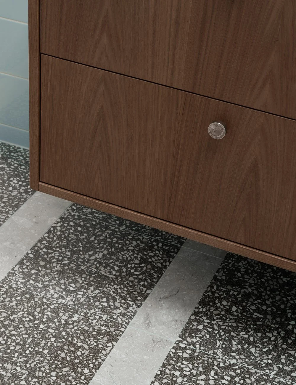
Beautiful material combinations in the bathroom, where warm oak meets blue tiles and terrazzo.
Architecture defined by materiality and soft contrasts
Throughout the home, strict lines and graphic forms are softened by wood, vivid colours and generous natural light. The prefabricated concrete elements give the house a distinct architectural identity, while the warm materials introduce softness and warmth, gently balancing its brutalist influences.
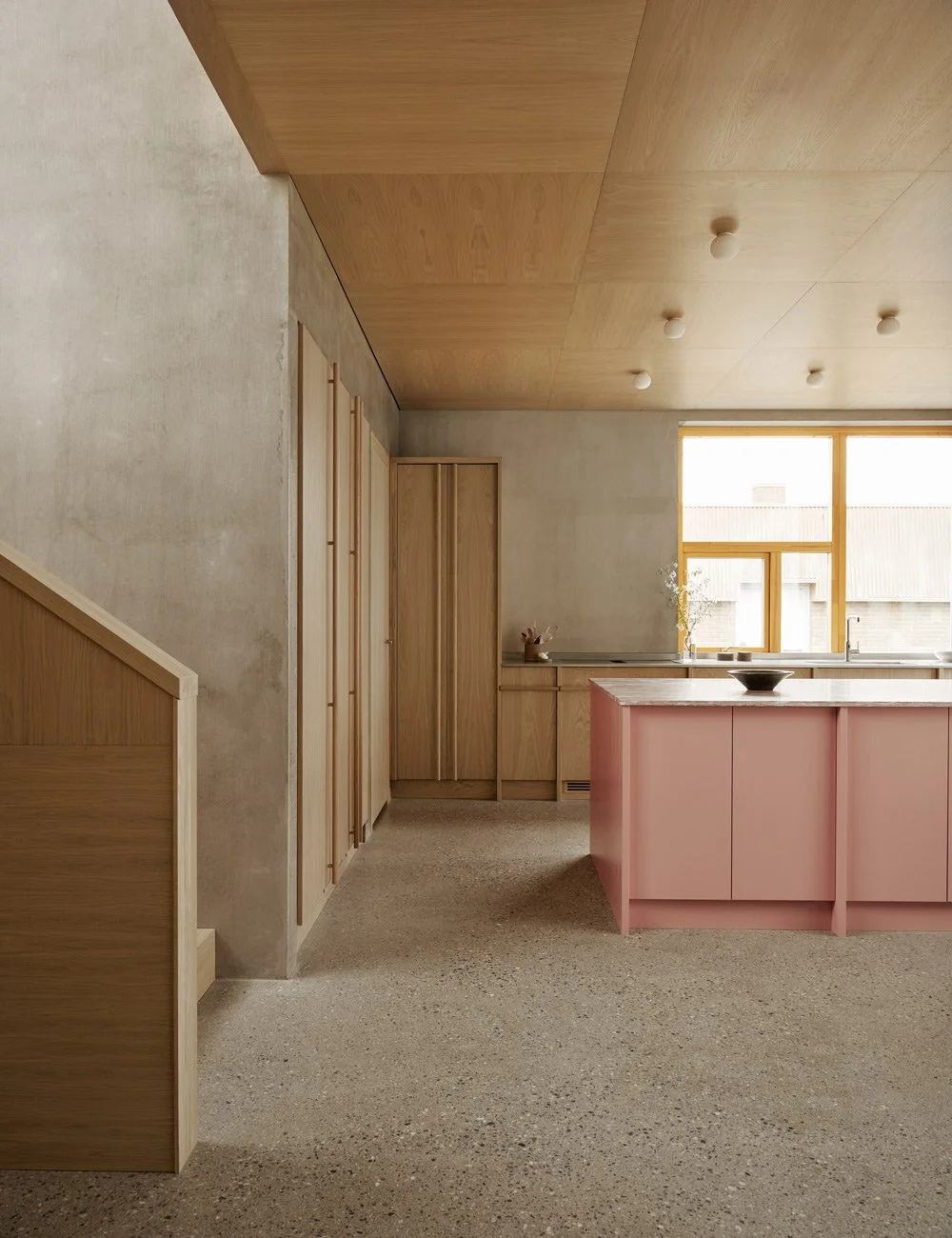
Soft contrasts, tactile materials and architectural details come together to create an expression that feels playful, yet warm and cohesive. Vase by Audo Copenhagen.
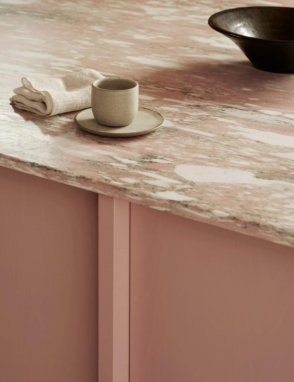
The Norwegian Fauske marble, with its pink, green and soft white tones, pairs beautifully with the colour of the kitchen island.
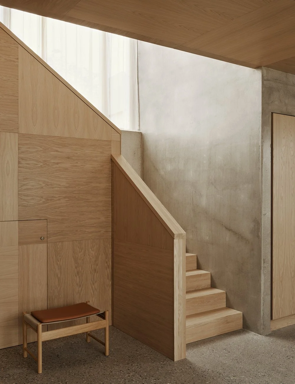
The staircase is clad in a geometric pattern using oak veneer from Nordiska Kök, which continues throughout the upper floor.
The floors are polished concrete, while the ceilings are clad in oak veneer from Nordiska Kök. On the upper floor, dark and light oak are combined in a chequered ceiling pattern. On the ground floor and in the bedrooms, light oak ceilings create warmth and continuity, with the veneer laid in different directions to introduce rhythm and movement. Here, materiality becomes an essential part of the experience, where natural surfaces and tactile materials soften the home’s precise architectural language.
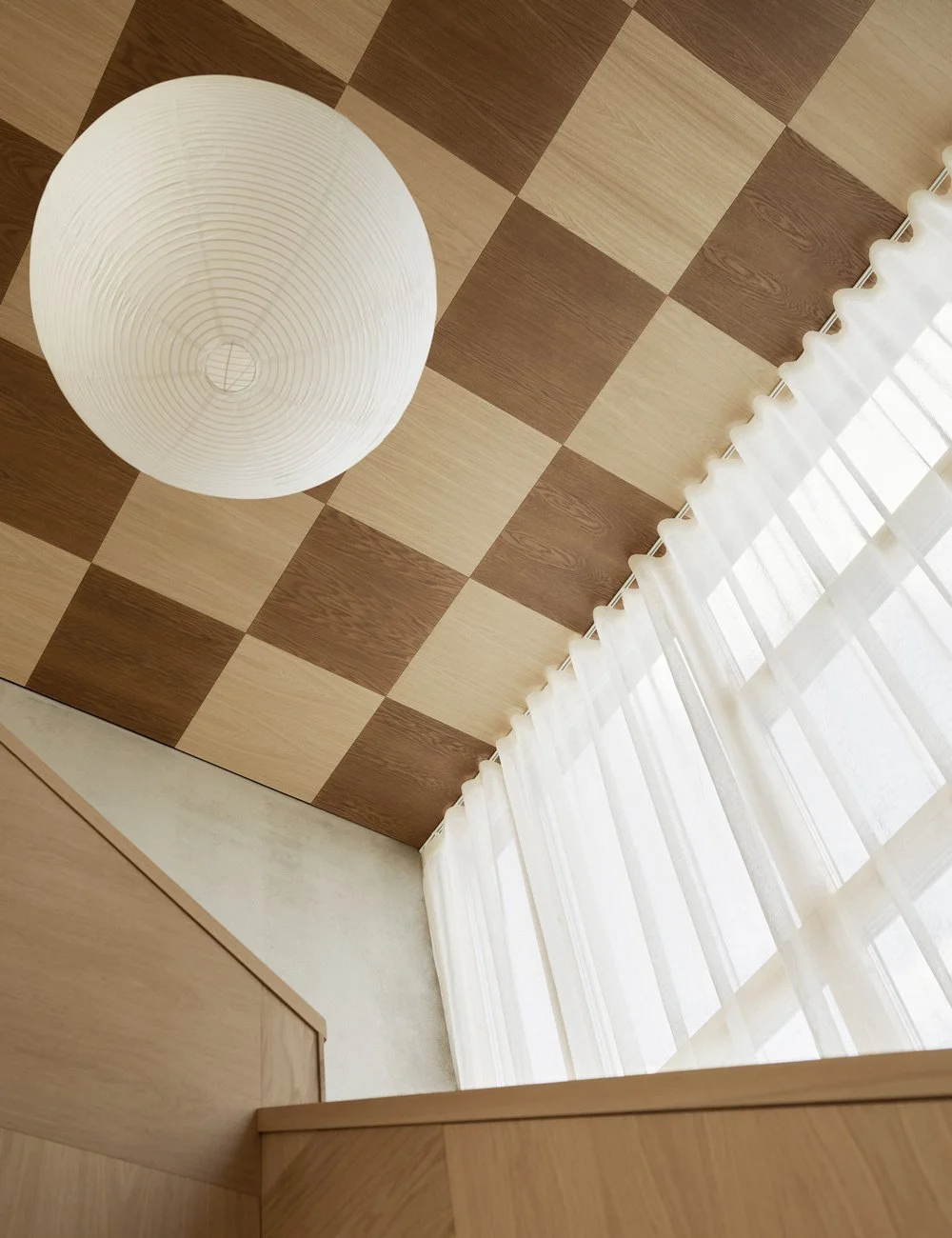
Geometric forms recur throughout the home — the chequered oak ceiling on the upper floor, clad in oak from Nordiska Kök, becomes a distinctive architectural feature that adds both character and visual interest. Rice paper lamp by Danish furniture company HAY.
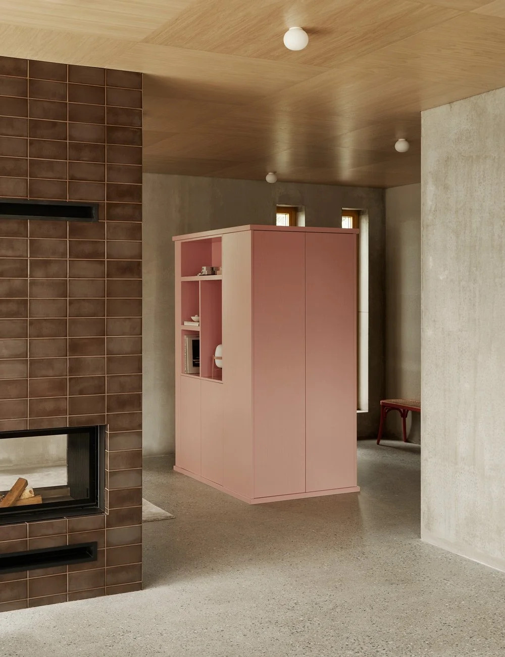
The pink hallway unit by Nordiska Kök has been designed as a minimalist and sculptural feature within the home — beautiful from every angle, while integrating both wardrobes and generous storage.
Light also plays a central role throughout the home. Along the western façade, narrow glazed sections create an irregular pattern that gives the house an almost sacral expression from the outside, while indoors the light feels dynamic and playful. Graphic details and geometric forms recur throughout several of the rooms, reinforcing the feeling of a carefully considered architectural language.
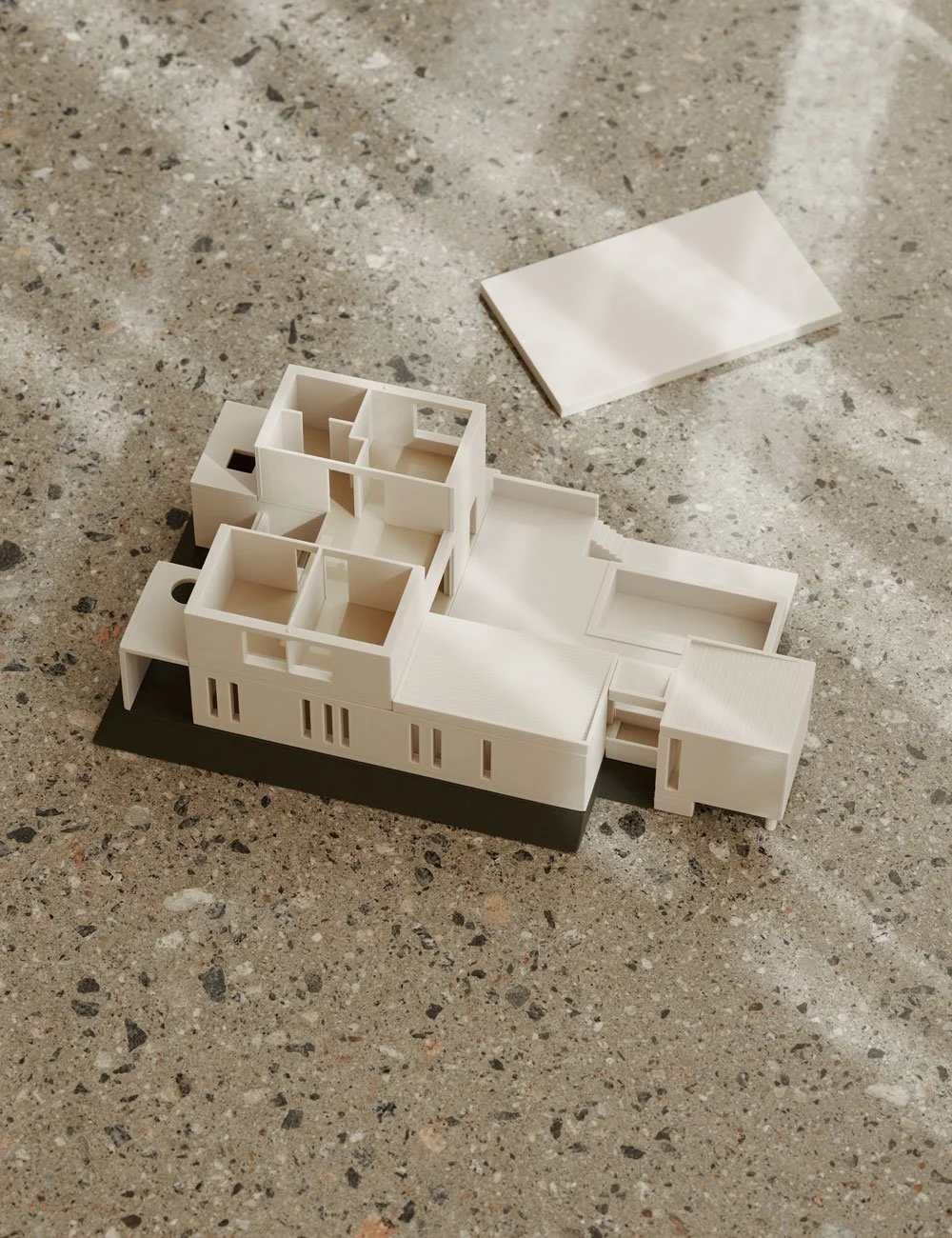
A 3D model of the house showing the circular opening in the ceiling, alongside the square window that Elin describes as the detail that captures the spirit of the house.
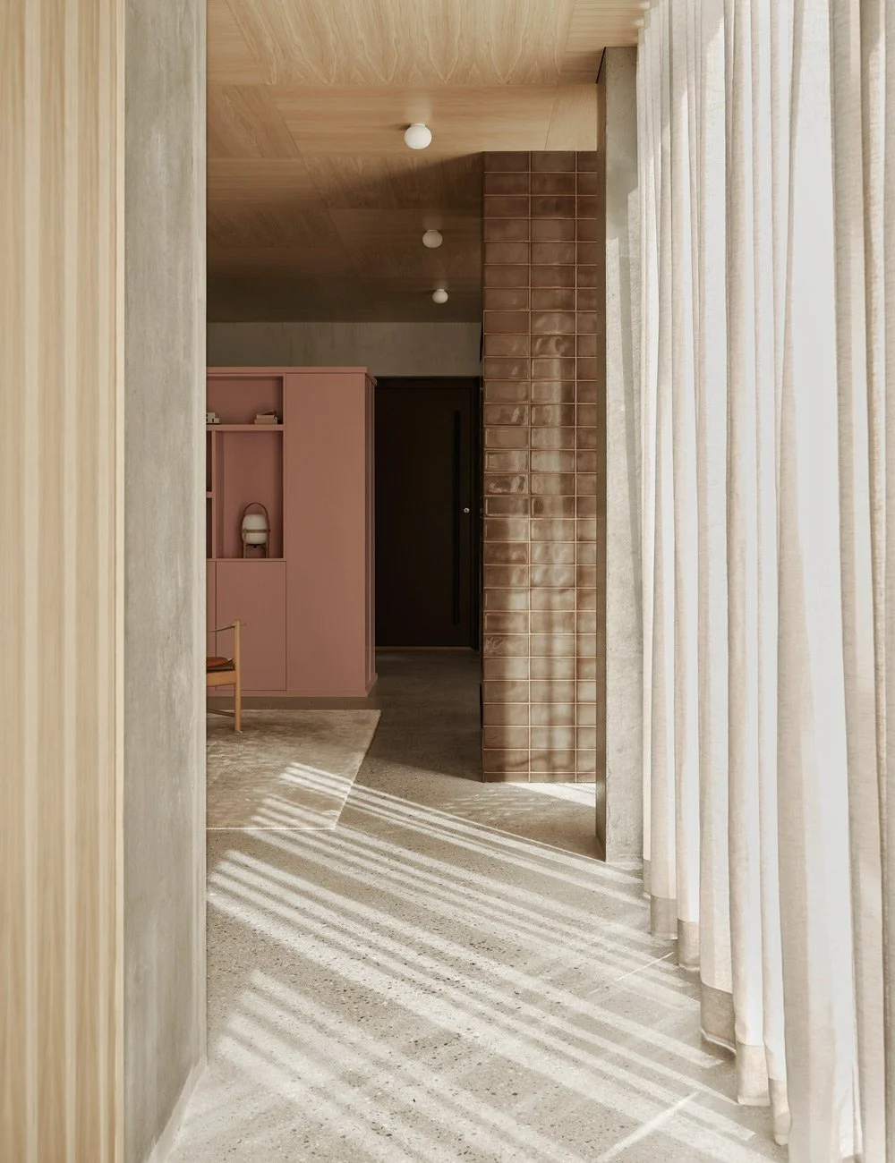
Natural light is carefully drawn into the house, creating beautiful shadow play across the floors and walls and becoming an essential part of the atmosphere.
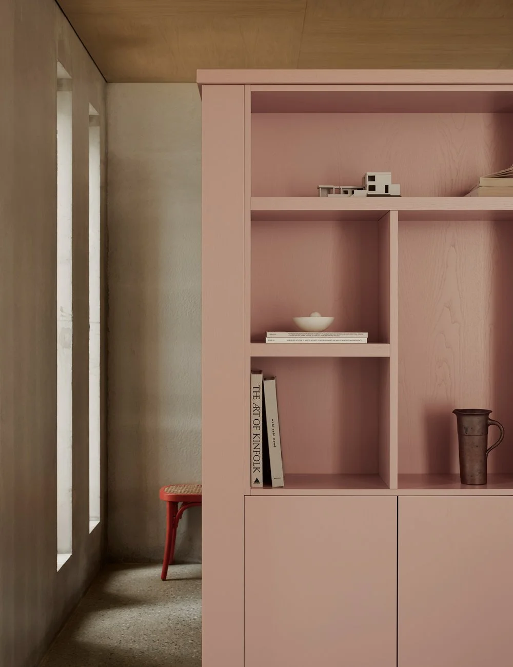
The pink hallway unit from Nordiska Kök acts as a beautiful room divider, incorporating both wardrobes and shelving with space for carefully selected objects and favourite pieces.
When asked whether there is a particular detail that reflects the character of the house, Elin explains that there are many elements that capture the spirit of the project – though one of the most defining details is encountered already at the entrance.
– There are many details I love about the house, but one specific feature that truly captures its character is the circular opening above the entrance, where the sky becomes visible the moment you step outside. Seen from above, the same idea reappears in a square window above the utility room – two geometric forms mirroring one another, positioned in roughly the same place but on opposite sides of the house.
Photo: Kristofer Johnsson for Nordiska Kök
Styling: Pella Hedeby
Architect: Elin Lorenzi
-
Brutalist architecture is an architectural style that emerged during the 1950s in the United Kingdom, among the reconstruction projects of the post-war era. It is characterised by raw materials, geometric forms and an honest, expressive use of structure. Often associated with exposed concrete, Brutalism emphasises function, clarity and a strong architectural presence.
-
Brutalist architecture is defined by bold, monolithic forms, exposed structural elements and a restrained material palette. Common features include raw or unfinished concrete, repetitive geometric patterns and a focus on functionality over ornamentation.
-
Concrete became a defining material of Brutalism due to its versatility and structural capabilities. It allowed architects to create sculptural forms and large-scale compositions, while expressing the material in its raw, unrefined state.
-
‘Béton brut’ is French for “raw concrete” and is the term from which Brutalism derives its name. It refers to concrete left unfinished, showcasing its natural texture and imperfections as part of the design.
-
While Brutalism is often perceived as stark, it can be softened through the use of natural materials such as wood, textiles and warm lighting. This contrast creates a more inviting atmosphere while maintaining the architectural integrity of the space.
The project is the result of a close collaboration between Nordiska Kök and architect Elin Lorenzi.
The kitchen and bespoke interiors are designed by Nordiska Kök and crafted in our carpentry studio outside Gothenburg, Sweden. We are proud to offer our bespoke high-quality kitchens and interiors to customers across Europe.
Learn more about the process of ordering a kitchen from Nordiska Kök.
Find more kitchen inspiration.