How to add colour to a Shaker kitchen
The classic Shaker kitchen is defined by its timeless design, balanced proportions and focus on craftsmanship. But classic does not have to mean neutral. Colour can give a Shaker kitchen a more personal expression while retaining the simplicity and character at the heart of the design. From soft yellows and muted greens to deeper reds, blues and earthy tones, colour can transform the character of a kitchen. The expression changes depending on the shade itself, but also on how it is combined with materials, hardware and the architecture of the room.
Here, we have gathered inspiration and ideas for creating a classic Shaker kitchen with colour.
See all Shaker kitchens | About our Shaker kitchens | Shaker kitchen prices
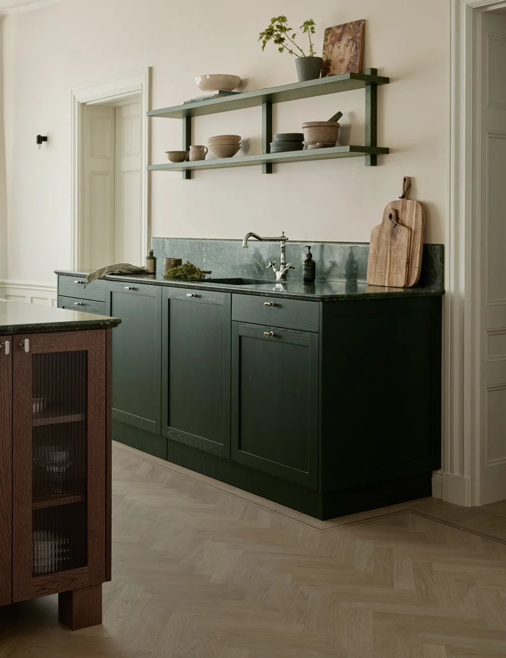
A classic Shaker kitchen rooted in traditional design, where a deep green adds elegance and personality while preserving the timeless character of the style.
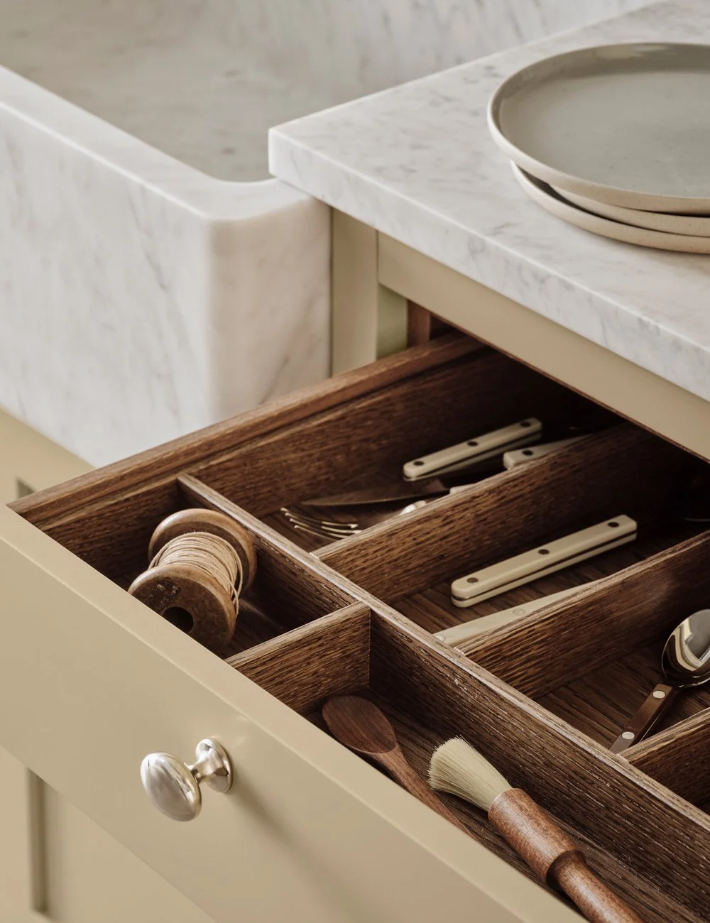
Shaker cabinetry painted in Nordiska Köks colour Pale Honey.
The classic Shaker kitchen as a starting point
The Shaker kitchen is characterised by its framed cabinet fronts, balanced proportions and understated design, with function and craftsmanship at its core.
It is this simplicity that makes Shaker design particularly well suited to colour. The framed fronts give the cabinetry a strong architectural character, while different colours can transform the overall look, from traditional and rustic to refined and contemporary.
At Nordiska Kök, every Shaker kitchen is made to order in our joinery in Gräfsnäs, Sweden, and can be painted in any colour of your choice. Both the colour and proportions can be tailored to suit your home and the overall look you want to achieve.
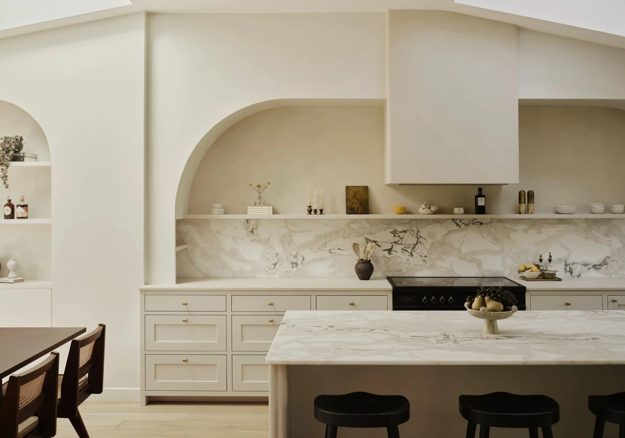
A timeless, elegant Shaker kitchen in a soft, tonal palette.
Yellow Shaker kitchens – warm and timeless
Yellow has a natural place in the classic kitchen. From pale, almost creamy shades to warmer and more saturated yellows, the colour can create a warm and inviting expression.
Soft yellow works particularly well with natural materials such as limestone, marble and wood. The result feels classic without becoming traditional, while offering a subtle alternative to beige, white and greige.
For a more cohesive expression, walls and cabinetry can be kept within a closely related tonal palette. To give the joinery more definition, create a clearer contrast between the kitchen and the surrounding walls.
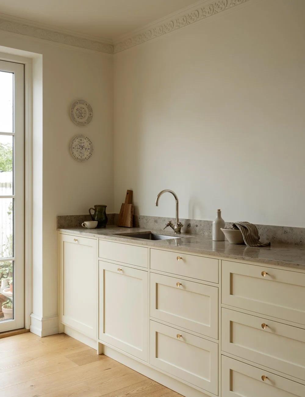
Shaker kitchen in a soft, light yellow tone, paired with a limestone worktop, brass hardware and walls painted in a closely related shade for a cohesive, harmonious expression.
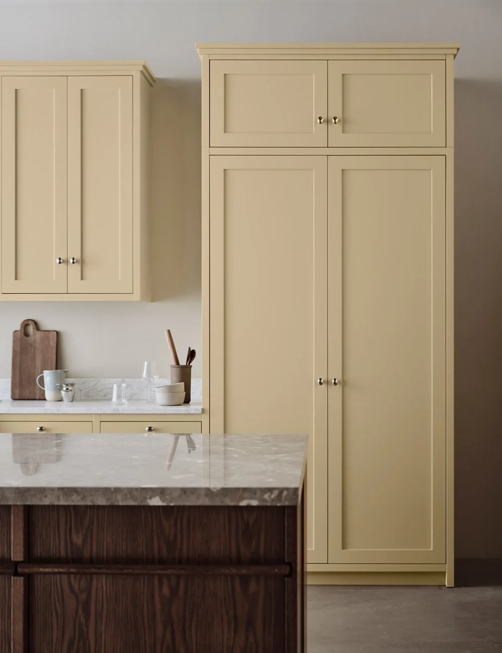
Warm butter yellow Shaker cabinetry paired with a dark wood island and natural stone worktop.
Green Shaker kitchens – from sage to moss green
Green is a natural choice for a classic Shaker kitchen. Muted green tones pair particularly well with wood, stone and other natural materials often found in classic kitchen design.
A light sage green creates a softer expression, while olive, moss and deeper forest greens bring greater depth and character.
Green also works beautifully with many types of natural stone. Light marble can create a distinct contrast against dark green cabinetry, while limestone and warmer stones create a softer, more tonal material palette.
Brass hardware can emphasise the classic character, while stainless steel or chrome takes a green Shaker kitchen in a more contemporary direction.

An elegant Shaker kitchen in a deep, sophisticated green, paired with marble and classic detailing for a timeless expression.

Dark green marble worktop paired with deep green cabinetry.

Sage green Shaker kitchen with limestone worktop and brass hardware.
Blue Shaker kitchens – a classic colour with depth
Blue can range from pale grey-blue to deep navy, creating very different expressions depending on the depth and undertone of the colour.
Muted blues and grey-blues create a softer palette and work with both light and dark woods. A deeper blue Shaker kitchen has a stronger presence and can be balanced beautifully with light natural stone, wood and metal.
As with green, the undertone matters. A blue with a grey undertone creates a very different expression from a clearer, more saturated blue, even when the colours initially appear quite similar.
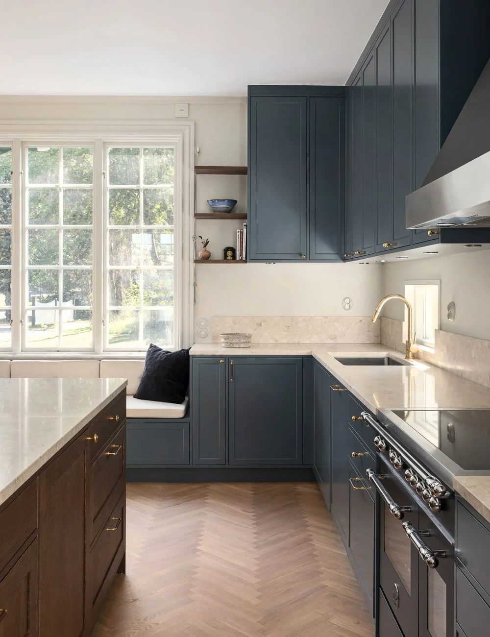
Deep navy blue Shaker kitchen with brass hardware, beige terrazzo worktops and a dark oak kitchen island.

Blue Shaker kitchen with a marble worktop and stainless steel details.
Pink and soft red Shaker kitchens
Pink does not necessarily make a kitchen feel romantic. Muted pinks, powdery tones, terracotta and shades with brown or grey undertones can create a refined expression against the classic lines of Shaker cabinetry.
Paired with oak, the palette becomes warm and tactile, while stainless steel introduces a more unexpected contrast that brings a contemporary element to the classic design.
Undertones often make the difference. More muted and nuanced colours tend to work particularly well with natural materials and make it easier to connect the kitchen palette with colours elsewhere in the home.
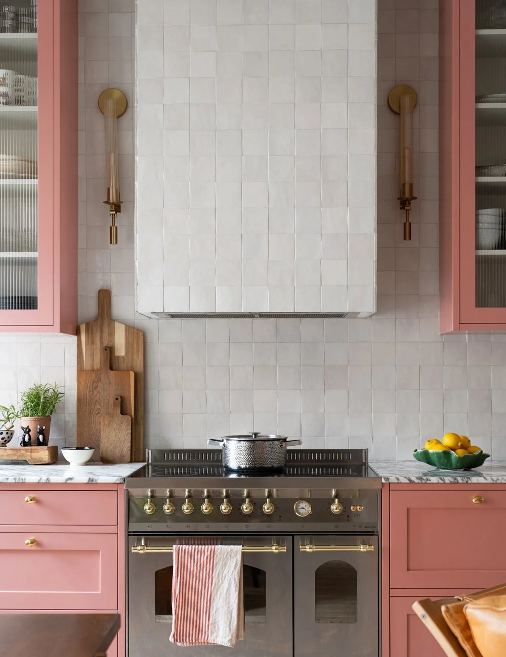
Set against the white tiles, the soft pink Shaker cabinetry is allowed to take centre stage, bringing colour and personality to the kitchen.

Pink Shaker kitchen with fluted glass kitchen cabinets, Arabescato marble worktop and brass hardware.
Brown, beige and earthy kitchen colours
Brown and earthy shades bring warmth and depth to a classic kitchen, ranging from soft taupe and clay tones to richer shades of brown.
These colours have a natural affinity with materials such as oak, limestone and marble, making them particularly suited to layered, tonal palettes. A warm brown Shaker kitchen can sit quietly alongside natural materials, while deeper shades create a stronger and more enveloping expression.
Earthy colours can also be a good alternative to traditional neutrals. Their complex undertones give the kitchen character while retaining a sense of warmth and timelessness.
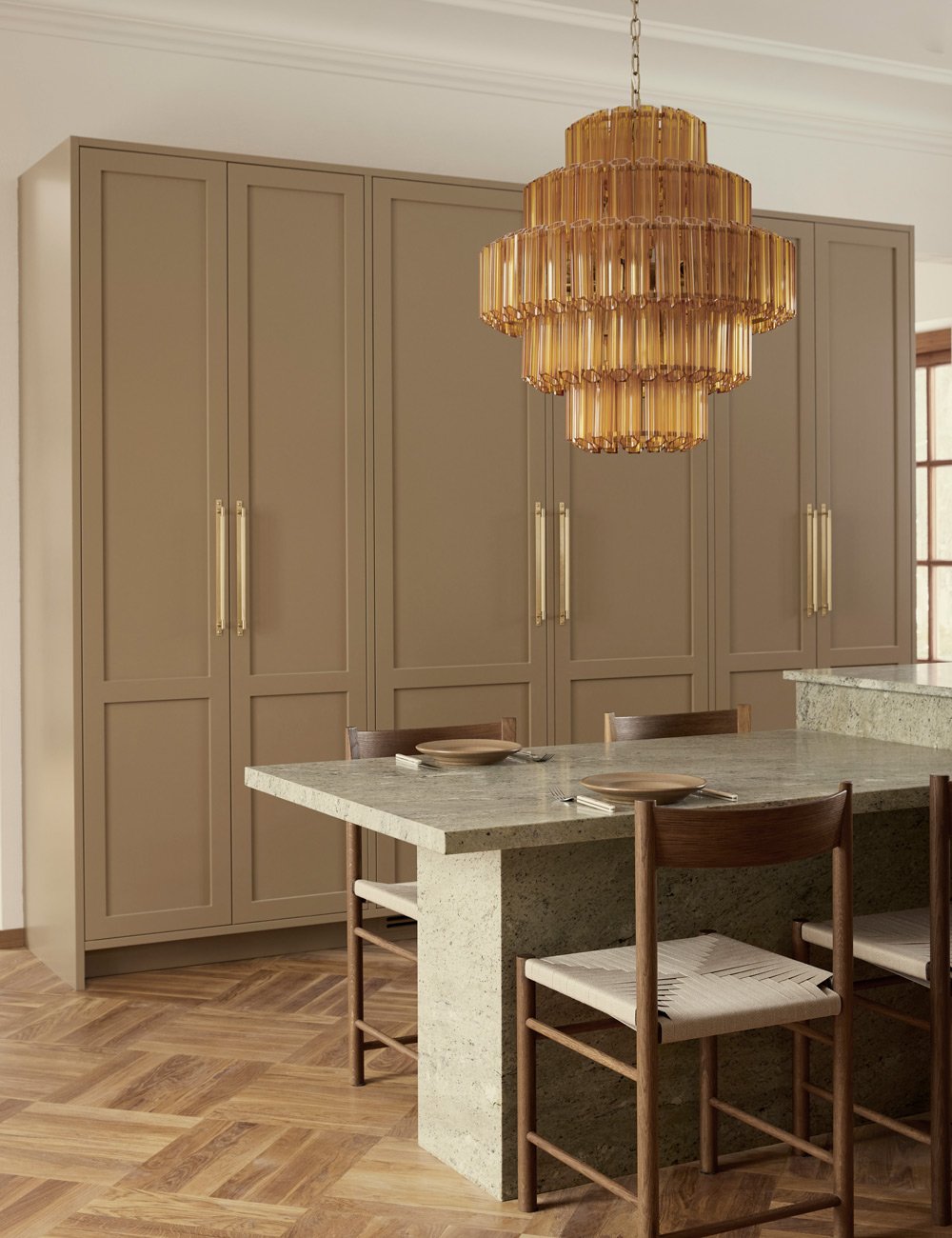
Elegant Shaker cabinetry painted in Nordiska Kök’s colour Desert Clay, a muted beige tone that is both timeless and gives the kitchen a refined, calm expression.
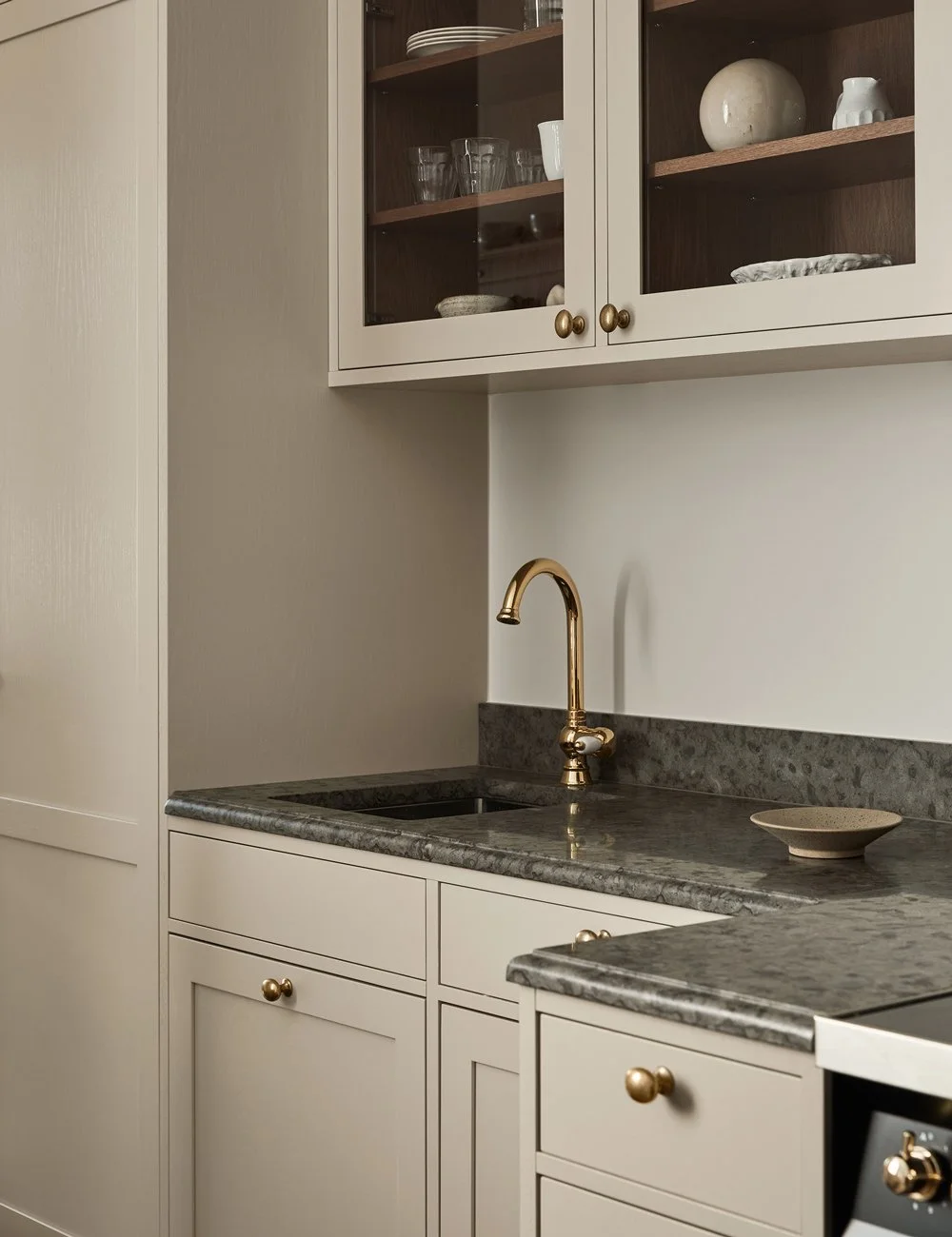
Soft beige Shaker kitchen with worktop and splashback in Kinnekulle limestone and brass hardware.
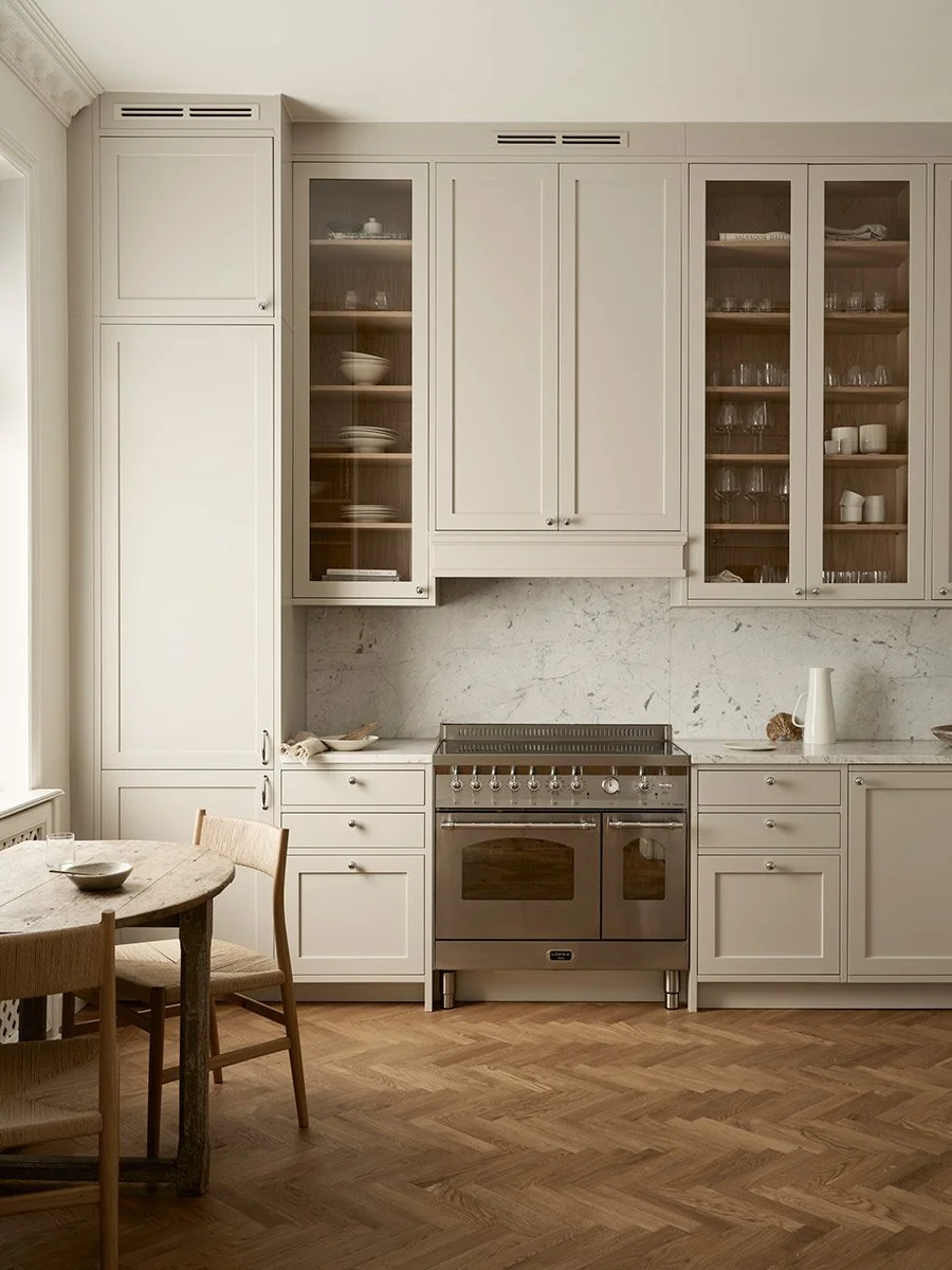
Soft beige Shaker cabinetry pairs beautifully with warm oak and natural stone, creating a light yet warm tonal palette with a soft, inviting atmosphere.
Add colour to the kitchen island
Not every element in the kitchen needs to be the same colour. Giving the kitchen island a different shade from the surrounding cabinetry is one way to introduce colour without allowing it to dominate the entire room.
A dark green, blue or burgundy kitchen island can create a distinct contrast within an otherwise light Shaker kitchen.
For a more subtle approach, choose two closely related shades – perhaps a lighter colour for tall and wall cabinets and a slightly deeper tone for the kitchen island or base cabinets.

Adding colour to the kitchen island is a clever way of introducing personality and creating a natural focal point without overwhelming the space.
Let colour and materials work together
In a colourful kitchen, colour should never be considered in isolation. Wood, stone, metal and flooring all form part of the kitchen's overall palette.
A strongly veined marble may contain several tones that can become the starting point for the kitchen colour. Limestone can provide a quieter, warmer foundation. The tone of the wood also affects how the painted cabinetry is perceived, from pale, white-pigmented oak to richer, darker wood finishes.
Begin with the materials that are intended to remain for many years and build the colour palette around them.
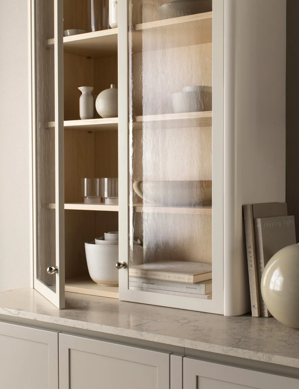
Marble often contains several subtle tones, offering a natural starting point for choosing a kitchen colour that complements the stone.
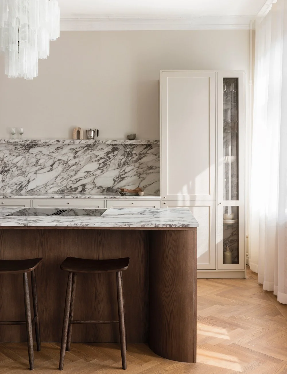
The tone of the wood also influences how painted cabinetry is perceived. Choose contrasting tones to create definition and draw the eye, or closely related tones for a softer, more tonal expression.
Tone on tone or contrast
A colourful Shaker kitchen does not have to rely on strong contrasts.
By choosing the same or closely related tones for the walls and cabinetry, colour can become part of the architecture itself. Variations in material, finish and texture add depth even within a relatively restrained palette.
For a more defined expression, work with contrast instead. Dark cabinetry against lighter walls, or a colourful kitchen within an otherwise neutral interior, gives greater emphasis to the form and proportions of the joinery.
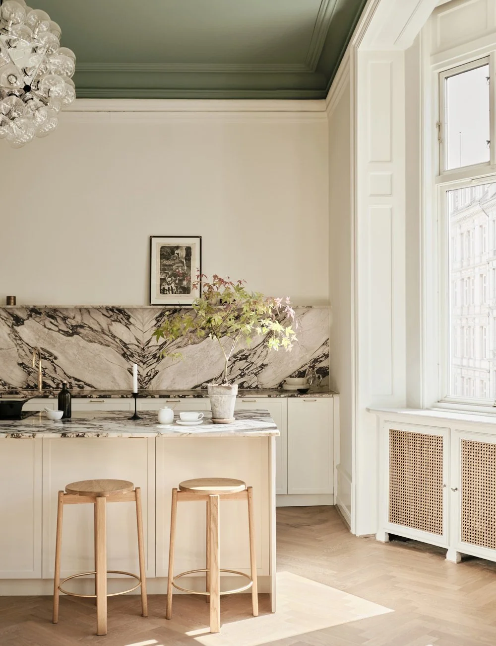
Tone on tone – closely related tones for the walls and cabinetry, variations in material (EXEMPEL)

Beige Shaker cabinetry is paired with Bianco Carrara marble and light oak interiors that echo the oak parquet flooring, creating a layered, tonal palette where subtle variations in material and texture add depth.
5 tips on how to choose a colour for a Shaker kitchen
1. Consider the whole home
Do not consider the kitchen colour in isolation. Think about how it relates to the rest of the home and the overall interior.
2. Work with the existing palette
Look at the flooring, stone, wood and existing colours, and consider whether the kitchen should sit naturally within the overall palette or create a deliberate contrast.
3. Test the colour in the room
Always test the colour in the room itself, placing the sample alongside the materials it will actually meet.
4. Consider the natural light
Natural light has a significant impact on how a colour is perceived. The same shade can appear very different in north- and south-facing rooms, and its character will shift with the light throughout the day.
5. Don’t be afraid of colour
Above all, colour does not make a classic kitchen any less timeless. When colour, materials and proportions are considered as a whole, it can instead become an integral part of what gives a Shaker kitchen its individual character.
Discover more Shaker kitchens by Nordiska Kök.
Learn more about the process of ordering a kitchen from Nordiska Kök.
Find more kitchen inspiration.